
Hello everyone, Today we are going to share 25+ Useful Web Design Tutorials – About Some Techniques. Responsive web design is still massively popular form of web design, but it can be daunting if you have limited or no experience. Thankfully, we’ve rounded up these really useful tutorials to help you from day one. These tutorials are just for you. We have curated a list of some amazing Web-Design Tutorials which will help you to learn some pretty interesting things you can do.
So here is the list of 25+ Useful Web Design Tutorials – About Some Techniques.
Build a basic responsive site with CSS

Responsive design is much misunderstood. Jason Michael lays to rest some myths, and then walks us through building a simple responsive website.
Animating Personal Skill Bars With CSS3 Keyframes

This design technique is commonly found on personal portfolios or design studio websites. Skill bars represent a level of knowledge related to certain tasks – web design, illustration, branding, character design, you name it! Adding some fancy animations to these skill bars will provide a quicker connection to the viewer.
Responsive Web Design

Responsive web design is the practice of building a website suitable to work on every device and every screen size, no matter how large or small, mobile or desktop. Responsive web design is focused around providing an intuitive and gratifying experience for everyone. Desktop computer and cell phone users alike all benefit from responsive websites.
How to Create (Animated) Text Fills

A tutorial on how to create various types of (animated) fills and strokes for text using different techniques including CSS and SVG.
Creating Dynamic, Animated Section Links

When creating markup for longer written pieces on a single page, it’s often important to create navigational structures to jump between different portions of that text. This is supported natively in HTML, allowing us to skip to sections within a page and even visit them directly from external links.
Braindump on responsive web design

Chris Coyier explains the very basics of what ‘responsive web design’ has come to mean, with examples, related resources, relevant people, tips and tricks, and more.
Responsive web design: a visual guide

These days, ‘one size fits all’ is quickly becoming a dated concept. Luckily, with CSS media queries, we can now easily build responsive web designs that accomodate everything from your mobile phone to your massive desktop, as this video tutorial demonstrates.
Responsive web design: what it is and how to use it

Almost every new client these days wants a mobile version of their website. It’s practically essential after all: one design for the BlackBerry, another for the iPhone, the iPad, netbook, Kindle — and all screen resolutions must be compatible, too. In the next five years, we’ll likely need to design for a number of additional inventions. When will the madness stop? It won’t, of course.
Styling And Animating SVGs With CSS

How to export and optimize SVGs, techniques for embedding them and how each one affects the styles and animations applied, and then we’ll actually style and animate with CSS.
Creating a Collection of CSS3 Animated Pre-loaders

Pre-loaders are a common sight in modern web design. As users we expect the web to be fast and fluid – we don’t like waiting for things. Pre-loaders offer visual feedback in the event of content being loaded, thereby managing expectations and reducing the chance of a user abandoning your website.
How to add responsive video to your website

Responsive web design has changed the way we approach video. John Surdakowski explains how to add it responsively to your website.
How to Give Your Logo the Slip Scroll Effect
we’re going to use JavaScript to create a simple, flexible, parallax effect where a logo seemingly changes colors with the background it’s on when the user scrolls.
Create Fullscreen HTML5 Page Background Video

While we can’t yet set a video for the background or background-image CSS properties – they can only take bitmaps, SVG images, colors and gradients as values – it is possible to fake the appearance of a background video by forcing it behind other HTML elements. The challenge is to have the video fill the browser window, making it as responsive as
How to Build an Off-Canvas Navigation Layout With Bootstrap

Bootstrap is designed to cater for lots of scenarios by providing a handful of commonly-used web components. There are buttons, a responsive navigation bar, tabs, tooltips, carousels, and so forth. Still, even with all the toys Bootstrap gives us, it is still missing a very popular pattern: the off-canvas navigation.
Design sites using the Responsive Grid System

The Responsive Grid System isn’t a framework or a boilerplate. But it does make creating responsive websites quick and easy. Graham Miller, its creator, explains how to use it.
Introducing responsive web typography With FlowType.JS

It’s our great pleasure to support active members of the Web design and development community. Today, we’re proud to present FlowType.JS that allows a perfect character count per line at any screen width. This article is yet another special of our series of various tools, libraries and techniques that we’ve published here on Smashing Magazine: LiveStyle, PrefixFree, Foundation, Sisyphus.js, GuideGuide, Gridpak, JS Bin, CSSComb and Jelly Navigation Menu. — Ed.
Responsive Navigation Menu

Previously I wrote a tutorial on how to make a mobile navigation for responsive design, now I’ve discovered a new technique to produce a responsive menu without having to use Javascript. It uses clean and semantic HTML5 markup. The menu can be aligned left, center or right. Unlike the previous tutorial where it is clicked to toggle, this menu toggles on hover which is more user friendly.
Page Preloading Effect

A tutorial on how to re-create the page preloading effect seen on the website of Fontface Ninja. We are going to use CSS animations, 3D transforms and SVGs.
Convert Your Product Landing Page From PSD to HTML
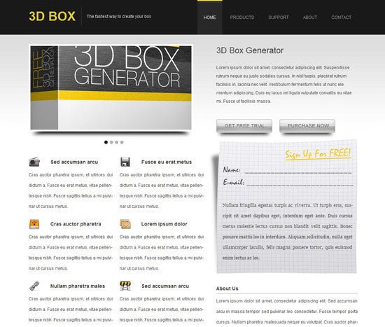
In this article you will learn how to convert Your Product Landing Page from PSD to HTML in a detailed step-by-step tutorial. You will learn how to create this layout by using a CSS framework, some CSS styles and Javascript. When you’ve completed this tutorial you’ll have a valid HTML/CSS, cross browser compatible and dynamic layout. I hope that you can go through this tutorial and learn a few techniques that will help you in future projects.
How To Create An Animated Sticky Header With CSS3 And Jquery

Trends come and trends go. The ones that stick around the longest do so because they solve a particular problem. A trend that’s popular right now for that very reason, is sticky elements; elements that behave normally until we scroll, and then maintain their presence on the page somehow.
Create a Responsive Slider with Sequence.js

Over the last few years, jQuery has become a new standard for how we present content and images in an eye catching and organized manner on the web. Because of being easily customizable, light-weight and having unlimited possibilities, believe it or not, it’s being used by 60.5% of all websites in present.
How To Create A Tiled Background Slideshow

A tutorial that shows how to recreate the four tiles slideshow effect seen on the website of Serge Thoroval. Using 3D transforms, transitions and animations, the aim is to implement a smooth effect and add some variations.
How To Create A Scrollable Splash Screen With CSS3 And Jquery

A great way to catch the attention of a visitor to your website is a “splash screen” or an “intro screen”. However, making a successful one is very difficult for one simple reason: splash screens easily irritate users.
Build a Dribbble Portfolio Grid With Flexboxgrid and Jribbble

Building with a grid has become an everyday requirement for front-end developers. Not only do grids provide a sense of rhythm and consistency in design, but when a well-known grid structure is used it provides a simple collective design language for cross–team work.
How to Make a Digital Clock with jQuery and CSS3

It all started last week when I saw this pretty dribbble shot. I immediately felt the urge to convert it into a working clock and share it with Tutorialzine’s readers. If you’d like to learn how I made it, read on!
Creating a Border Animation Effect with SVG and CSS

The website of Carl Philipe Brenner has some very creative and subtle animations and today we want to explore how to recreate a border animation effect using CSS transitions on SVG lines.