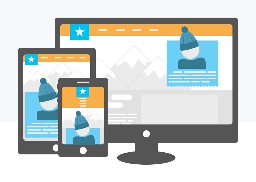
The current mobile phone era has drastically changed the way users browse, search, and shop online. This necessitates webpages to be tailored for fast page load speeds, and optimized for small screens.
This article provides comprehensive instruction for bettering image performance on mobile devices. We walk you through essential components of image optimization such as employing appropriately sized photos that are designed with mobile in mind.
Resize Mobile Photos
To give your website an edge when loading on smartphones, optimizing the size and resolution of images is key. But when cutting down their size, finding a balance between quality and transformation can be tricky. As a solution, make use of two top-level strategies: resizing and compressing your visuals specifically for mobile use.
Let’s begin with resizing your photos. Utilizing a free photo cropper proves to be one of the quickest and most effective solutions for compressing your mobile images. This versatile online tool offers a user-friendly interface that simplifies the process of cropping photos.

The standout feature of the picture cropper tool from Watermarkly is its batch-oriented interface. It simplifies the editing of multiple photos in an instant, saving users the laborious task of manual resizing files through their native Windows/Mac tools. With automated processing, users no longer have to suffer through tedious manipulation of large quantities of images, leaving more time for creativity and efficiency.
What’s the Best Photo File Size for Mobile?
Identifying the correct size for mobile files is nowhere near an effortless task, however, two factors should be taken into account:
- It is essential to bear in mind the different viewport sizes for various kinds of electronic gadgets. Desktops have a resolution of 1280 px, tablets 640 px, and smartphones 320 px.
- The size of the image relative to the viewer’s window.
To ensure your product’s efficient development, take advantage of design programs such as Sketch which provide optimized wireframes and layouts for various devices.
Compress Images Optimized For Mobile Devices
Once images are resized, the next step towards improved mobile performance is to compress them to reduce their file sizes.
Achieve the desired result on mobile devices by compressing images. This process decreases file size while maintaining quality, allowing you to get the most out of each file. It’s like a win-win situation for all!
When it comes to shrinking images, most people turn to Photoshop and Lightroom, but the output is not always as hoped. For those times when you need to process a lot of photos quickly and without sacrificing their quality, Watermarkly or similar online photo editing tools can serve as a valuable alternative. Not only is it fast and easy to use, but no experience is necessary.
Select the Right Image Format
When selecting a file format for mobile pictures, it’s important to make the right choice in order to reduce their size. JPG is often employed, however it may not be the best option. WebP is an improved and more modern type of file that yields impressive storage savings in comparison to JPEG or PNG files, ranging from 24-36%. Utilizing this format whenever possible can save you both time and space.

By embracing the WebP format, WordPress now offers enriched possibilities. You can make sure your mobile website looks flawless with images of the highest quality and the smallest files size achievable.
Taking into consideration the various types of photos used on hand-held devices, Google has assembled a handy selection of formats designed to make them as efficient as possible:
- WebP: An ideal choice for photos and other visuals with high transparency that offer superior compression.
- JPEG: Suitable for photos without transparency.
- PNG: Suitable for graphics with semi-transarent or semi-opaque pixels.
- SVG: Ideal choice for creating easily resizeable symbols and figures.
Incorporate Lazy Loading
Boost your mobile page’s performance by utilizing lazy loading for images. Instead of attempting to load off-screen visuals immediately, lazy loading only loads them upon request. Deploying this method will help speed up your mobile page quickly.
You may have already come across lazy loading in action before. Usually, this happens when the placeholder image takes the place of the full file in a certain moment.
To ensure websites are loading as quickly as possible, modern web browsers come with built-in features like the ‘loading’ attribute, for pictures and iframes. Yet if you want an added layer of optimization, external libraries are available. Some of the most widely-used options are the following:
- LazyLoad: A great plugin that can drastically reduce the amount of requests sent out to the servers.
- Intersection Observer: For superior intersection management, this API empowers modern web browsers with sophisticated capabilities.
- Echo.js: A streamlined library purposefully built to optimise the loading of JPEGs with a minimum amount of code.
A Final Word
All in all, optimizing your images for mobile usage is one of the most affordable ways of boosting your conversion rates. Automated processes are readily available that enable comprehensive optimization for a tailored experience on any device. Allocating these considered strategies into a business’s key performance indicators (KPIs) should be mandatory to obtain desired metrics.