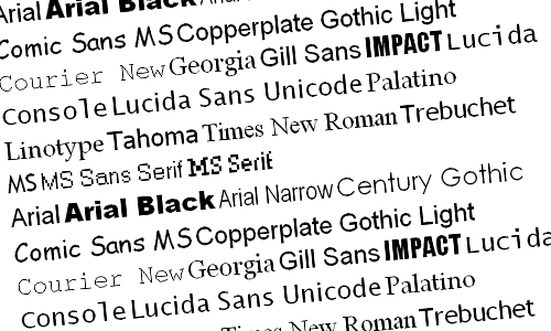
There are a few fonts that you can use to make sure your website is looking right without using Arial or Times New Roman. I managed to whip up a short list of 32 of my own favorite typefaces, each paired along with a brief description and common font combinations in CSS that you will hopefully find helpful or meaningful in some way.
SEE ALSO: 78 Best High Quality Resolution Wood Textures
Century Gothic

Century Gothic – A wide, light font. It shares several similarities with Avant Garde, another web-safe font, save for the lack of a descender on the lowercase u, and larger, rounder tittles (the dots above lowers i’s and j’s). Century Gothic is a practical font for display work, headers, and sometimes even subheaders, but I’d suggest steering clear away from it when writing out large blocks of text.
.classname {
color: #000000;
font-family: “Century Gothic”, CenturyGothic, AppleGothic, sans-serif;
}
* * * * *
Futura
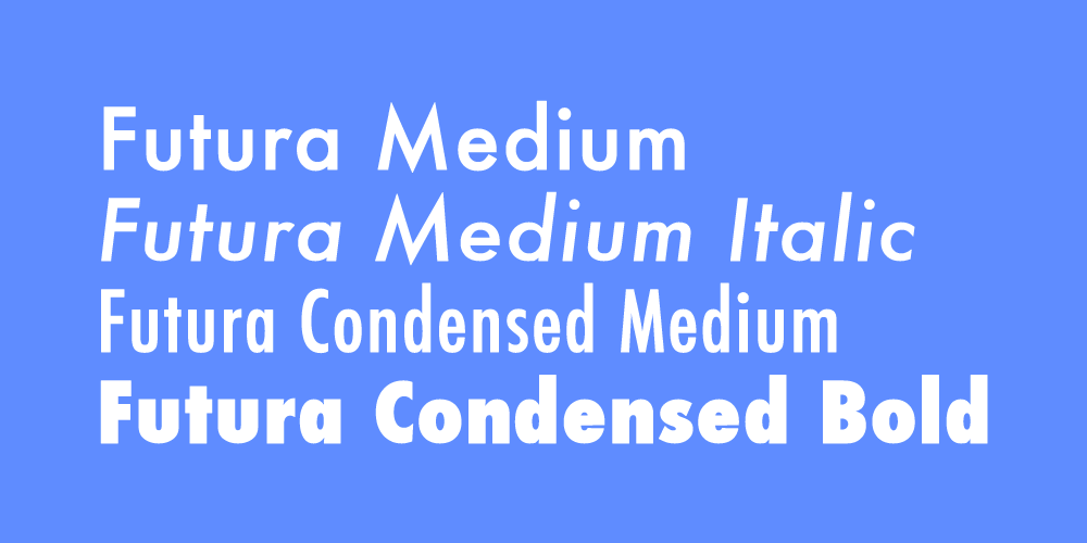
Futura – A family favorite sans serif typeface. Futura boasts geometrically balanced proportions, crisp and clean forms, and razor-sharp apexes. It’s a versatile font that draws the viewer in due to its rather unrestrained sense of forwardness, and is oftentimes used for both design and commercial purposes.
.classname {
color: #000000;
font-family: Futura, “Trebuchet MS”, Arial, sans-serif;
}
* * * * *
Helvetica – The designer
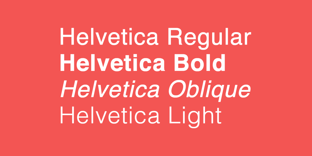
Helvetica – The designer’s go-to. It’s somewhat more refined than the ubiquitous Arial, using mostly horizontal/vertical strokes as opposed to the diagonals frequently found in Arial. Another couple solid features are its legibility and neutrality, two traits which render Helvetica a font adaptable for use on projects modern or classic, up-and-coming or traditional.
.classname {
color: #000000;
font-family: “Helvetica Neue”, Helvetica, Arial, sans-serif;
}
* * * * *
Rockwell – Typically
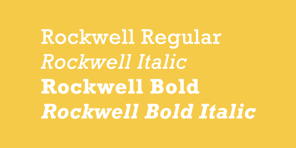
Rockwell – Typically, we might associate this font with a certain image: something extending from the western cowboy universe, or some other iconic variant. Rockwell, however, should not be underestimated (or stereotyped in such a way) – its robust slab “square” serif design sets the typeface apart as an honest display font ideal for poster text and bold headliners.
.classname {
color: #000000;
font-family: Rockwell, “Courier Bold”, Courier, Georgia, Times, “Times New Roman”, serif;
}
* * * * *
Baskerville
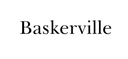
Baskerville – A transitional font that stems from classic typefaces and at the same time, uses the high contrast, vertical stress, and sharp finishes found in more modern fonts. Serifs are generally more horizontal and tapered than those of its old style predecessors. Baskerville is a solid choice if you want to convey something more serious and refined/something that seeks agreement and respect.
.classname {
color: #000000;
font-family: Baskerville, “Baskerville Old Face”, “Hoefler Text”, Garamond, “Times New Roman”, serif;
}
* * * * *
Didot
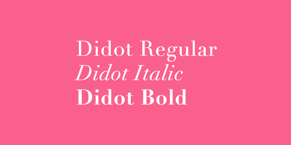
Didot – A modern serif font that takes the contrasts of transitional fonts like Baskerville to the extreme. Didot features abrupt, unbracketed, thin serifs, and high contrasts between thick and thin strokes, creating an overall appearance that is in control and unmistakably elegant. Use it with generous margins and lots of white space for the best results.
.classname {
color: #000000;
font-family: Didot, “Didot LT STD”, “Hoefler Text”, Garamond, “Times New Roman”, serif;
}
* * * * *
Garamond
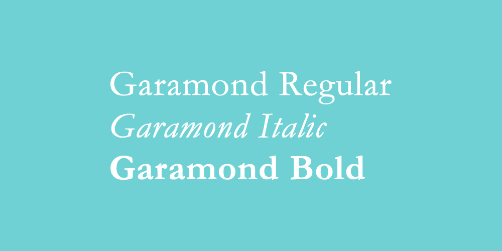
Garamond – A serif font that is easily recognizable by its excellent readability and dignified appearance. It’s well-suited for a range of applications probably in part to its large family of faces/interpretations. In general, Garamond is great for newsletters, business forms and cards, and anything official in between. Feel free to use it for blocks of text.
.classname {
color: #000000;
font-family: Garamond, Baskerville, “Baskerville Old Face”, “Hoefler Text”, “Times New Roman”, serif;
}
* * * * *
Impact

[css].classname {
color: #333333;
font-family: Impact, Charcoal, sans-serif;
}[/css]
[css].classname {
color: #333333;
font-family: ‘Palatino Linotype’, ‘Book Antiqua’, Palatino, serif;
}[/css]
[css].classname {
color: #333333;
font-family: Tahoma, Geneva, sans-serif;
}[/css]
[css].classname {
color: #333333;
font-family: Century Gothic, sans-serif;
}[/css]
[css].classname {
color: #333333;
font-family: ‘Lucida Sans Unicode’, ‘Lucida Grande’, sans-serif;
}[/css]
[css].classname {
color: #333333;
font-family: ‘Arial Black’, Gadget, sans-serif;
}[/css]
[css].classname {
color: #333333;
font-family: ‘Times New Roman’, Times, serif;
}[/css]
[css].classname {
color: #333333;
font-family: ‘Arial Narrow’, sans-serif;
}[/css]
[css].classname {
color: #333333;
font-family: Verdana, Geneva, sans-serif;
}[/css]
* * * * *
Copperplate Gothic Light

[css].classname {
color: #333333;
font-family: Copperplate / Copperplate Gothic Light, sans-serif;
}[/css]
[css].classname {
color: #333333;
font-family: ‘Lucida Console’, Monaco, monospace;
}[/css]
[css].classname {
color: #333333;
font-family: Gill Sans / Gill Sans MT, sans-serif;
}[/css]
[css].classname {
color: #333333;
font-family: ‘Trebuchet MS’, Helvetica, sans-serif;
}[/css]
[css].classname {
color: #333333;
font-family: ‘Courier New’, Courier, monospace;
}[/css]
[css].classname {
color: #333333;
font-family: Arial, Helvetica, sans-serif;
}[/css]
[css].classname {
color: #333333;
font-family: Georgia, Serif;
}[/css]
* * * * *
Baskerville
A classic serif font published by Bitstream. Baskerville is an elegant and stable serif font that will give your webpages a beautiful look.
font-family: Baskerville, “Baskerville Old Face”, “Goudy Old Style”, Garamond, “Times New Roman”, serif;
* * * * *
Palatino
Palatino was superstar type designer Herman Zapf’s first very popular font, it was based on his own calligraphy.
font-family: Palatino, “Palatino LT STD”, “Palatino Linotype”, “Book Antiqua”, Georgia, serif;
* * * * *
Bodoni MT
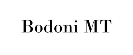
Widely used in the luxury industry, Bodoni MT or Didot are synonymous with elegance.
font-family: “Bodoni MT”, Didot, “Didot LT STD”, “Book Antiqua”, Garamond, “Times New Roman”, serif;
* * * * *
Georgia
Many designers already use Georgia on their website, a great option if you want a highly-readable font.
font-family: Georgia, Times, “Times New Roman”, serif;
* * * * *
Century Gothic
Century Gothic is a clean, rounded sans-serif font to give your site a modern look.
font-family: “Century Gothic”, CenturyGothic, Geneva, AppleGothic, sans-serif;
* * * * *
Tahoma
Tahoma is a sans-serif font that was designed specifically for on-screen display, it is very legible at small sizes.
font-family: Tahoma, Verdana, Segoe, sans-serif;
* * * * *
Arial Narrow
Arial is one of the most despised fonts by designers, but its condensed version looks actually quite decent (unless you compare it to Helvetica Condensed, then it looks bad).
font-family: “Arial Narrow”, Arial, “Helvetica Condensed”, Helvetica, sans-serif;
* * * * *
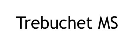
Trebuchet MS
Trebuchet is a humanist sans serif typeface designed for good screen readability by Vincent Connare, the guy who designed Comic Sans.
font-family: “Trebuchet MS”, “Lucida Grande”, “Lucida Sans Unicode”, “Lucida Sans”, sans-serif;
* * * * *
Consolas
Consolas is a nice monospaced font, perfect for programming or sharing code on your website.
font-family: Consolas, monaco, monospace;
* * * * *
Lucida Sans Typewriter
Lucida Sans Typewriter is a monospaced sans serif typeface with subtle curves and a good display on screen.
font-family: “Lucida Sans Typewriter”, “Lucida Console”, Monaco, “Bitstream Vera Sans Mono”, monospace;
* * * * *
Have something to add to this article? Share it in the comments.










Hello there! I simply want to give you a big thumbs up for your excellent info you have got here on this post. I will be returning to your website for more soon.
Good day! I am really impressed with your post, and I certainly learned a lot from it.
If they’re “web safe” fonts, why did you find it necessary to turn them into images?